15 Exterior House Colors to Turn Heads in the Neighborhood
Choosing the right exterior house color can completely change the way your home looks. A fresh paint color can make a small house appear more inviting, highlight architectural details, improve curb appeal, and give an older property a modern update.
But choosing a color for your home’s exterior is different from picking a shade for an indoor room. Exterior colors need to work with the roof, landscaping, windows, doors, stone, brick, and surrounding environment. Lighting also changes throughout the day, so a color that looks perfect on a small paint card may appear very different across an entire wall.
Whether you’re planning a complete exterior makeover or simply want to repaint your front door and trim, these 15 exterior house colors can help inspire your next project.
What Makes a Great Exterior House Color?
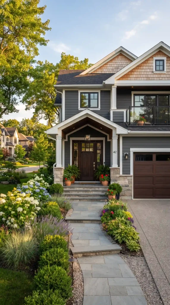
Before choosing a shade, think about the permanent features of your home.
Your roof color, driveway, brickwork, stone, window frames, and landscaping should all work with the paint.
The best exterior color is not necessarily the brightest one. A successful color should complement the architecture while giving the property its own personality.
It’s also smart to test paint samples outdoors. Look at them in morning, afternoon, and evening light before making the final decision.
1. Classic White
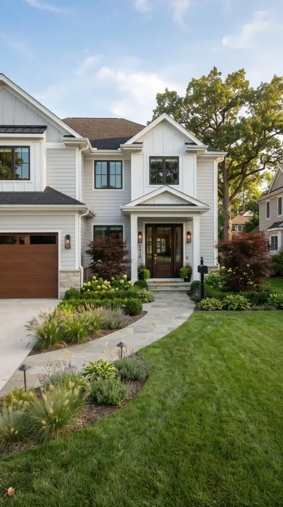
White remains one of the most versatile house exterior colors.
A crisp white exterior can give a home a clean, timeless appearance. It works particularly well with black, charcoal, gray, natural wood, and many landscaping styles.
For a classic appearance, pair white siding with a darker roof and contrasting shutters or a wood front door.
Best For
- Traditional homes
- Farmhouses
- Colonial-style properties
- Modern homes
If pure white feels too stark, consider a warmer off-white or creamy shade.
2. Warm Cream

Warm cream provides the brightness of white without feeling as sharp.
This color works beautifully with natural stone, warm wood, bronze hardware, and earthy landscaping.
Cream can also be more forgiving than bright white when it comes to dust and everyday exterior wear.
Design Tip
Combine a cream exterior with darker trim and a natural wood door for a welcoming appearance.
3. Charcoal Gray
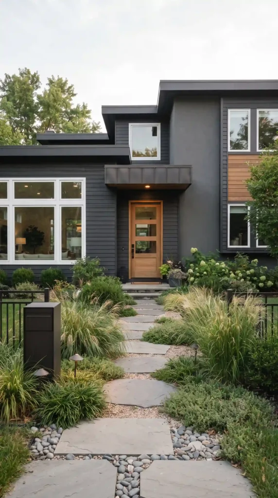
For homeowners who want a sophisticated and modern look, charcoal gray is an excellent choice.
Deep gray exteriors can create dramatic contrast against green landscaping, pale trim, and natural stone.
Charcoal works especially well on contemporary homes with simple architectural lines.
Best Pairings
- White trim
- Black accents
- Natural wood
- Stone
- Metallic lighting fixtures
Be cautious with extremely dark colors on homes that receive intense sunlight because darker surfaces can absorb more heat.
4. Slate Blue
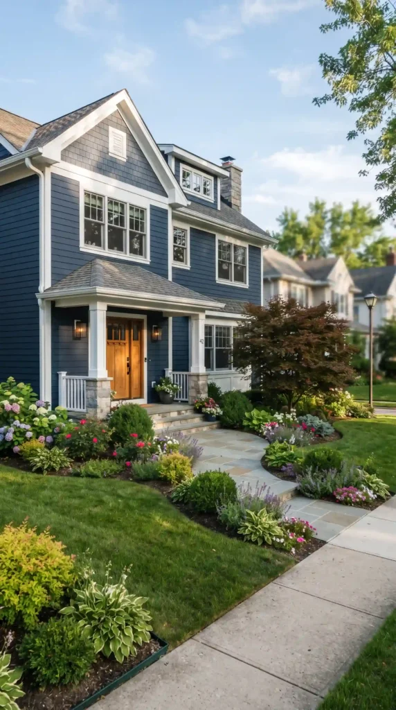
Slate blue offers a balance between traditional and contemporary design.
It has enough color to make your home interesting without becoming overwhelming.
A muted blue-gray works particularly well with white trim, dark roofs, and natural landscaping.
Why Choose It?
Slate blue can give a home a calm, refined appearance while still standing out from more common neutral exteriors.
5. Sage Green
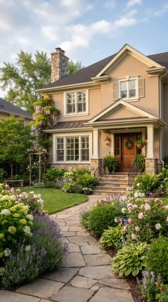
Sage green house exteriors are popular with homeowners who want their homes to blend naturally with the landscape.
The muted green works particularly well when surrounded by trees, shrubs, flower beds, or other natural elements.
It can look beautiful with creamy trim, warm wood, stone, and dark roofing.
Best For
- Cottage-style homes
- Craftsman houses
- Rural properties
- Homes surrounded by mature landscaping
6. Olive Green
For a deeper, earthier appearance, consider olive green.
Olive green has a natural quality that can make a home feel established and connected to its surroundings.
Pair it with cream or warm white trim rather than an overly bright white if you want a softer overall appearance.
Wooden doors and natural stone can further enhance the color.
7. Dusty Rose
Looking for something more distinctive?
A dusty rose exterior can add personality without becoming excessively bright.
Muted pink shades work particularly well on cottages, historic-style homes, and properties with romantic landscaping.
Pair the color with:
- Cream trim
- Dark gray roofing
- Natural wood
- Green plants
- Stone pathways
The trick is choosing a muted version rather than a highly saturated pink.
8. Terracotta
Terracotta can bring warmth and Mediterranean character to an exterior.
It works particularly well with stucco, tile roofs, stone, and drought-tolerant landscaping.
Because terracotta is a strong color, it can be balanced with neutral trim and understated doors.
Best For
- Mediterranean-style homes
- Southwestern homes
- Spanish-inspired architecture
- Warm-climate properties
9. Navy Blue
Navy blue is a timeless choice for homeowners who want a bold but sophisticated exterior.
It creates excellent contrast with white or cream trim and pairs well with natural wood.
A navy exterior can make a home feel substantial and polished.
Design Tip
Use navy on the main siding and reserve brighter or lighter colors for architectural details.
10. Soft Taupe
Taupe is a practical option for homeowners who prefer neutral exterior paint colors but want more warmth than traditional gray.
This shade works especially well with stone, brick, wood, and darker roofing.
Taupe can also provide a good backdrop for colorful landscaping because it doesn’t compete strongly with flowers and foliage.
Best For
- Traditional homes
- Suburban houses
- Ranch-style properties
- Transitional architecture
11. Greige
Greige, a blend of gray and beige, has become a popular design color because it combines the coolness of gray with the warmth of beige.
It is particularly useful when your home includes multiple exterior materials.
For example, greige can bridge the gap between cool stone and warm wood.
Pair it with black accents, white trim, or natural wood for a modern appearance.
12. Deep Forest Green
For a dramatic nature-inspired exterior, consider deep forest green.
This color can make a house feel grounded and sophisticated, especially when surrounded by mature trees.
It can work beautifully with warm wood accents and muted stone.
Forest green is especially effective when you want the house to feel connected to its natural setting.
13. Light Gray
Light gray is one of the easiest modern neutrals to work with.
Unlike a stark white exterior, light gray provides a little more visual depth while remaining versatile.
It can be paired with:
- White trim
- Black doors
- Natural wood
- Gray stone
- Dark roofing
It’s a particularly good option for contemporary and transitional homes.
14. Deep Brown
A rich brown exterior can create a warm, grounded appearance.
Brown works particularly well when the property contains natural wood, stone, or extensive greenery.
Instead of using a flat dark brown, look for shades with subtle warm undertones.
A deep brown home can feel especially attractive in wooded settings.
15. Black
Black is one of the boldest modern exterior house colors.
Used carefully, it can create a dramatic architectural statement.
Black exteriors work particularly well with modern homes that have strong lines, large windows, and minimalist landscaping.
However, black can make a home look smaller or more visually heavy, so consider balancing it with lighter trim, natural wood, concrete, or extensive greenery.
How to Choose the Right Exterior House Color
Choosing from 15 possibilities is easier when you narrow your options systematically.
Consider the Architecture
Traditional homes often work well with classic whites, creams, blues, greens, and warm neutrals.
Modern homes may suit charcoal, black, greige, or deep green.
The goal isn’t to follow a strict rule but to choose a color that complements your home’s architectural character.
Look at the Roof
Your roof usually stays in place much longer than paint, so it should influence your choice.
A warm brown roof may work better with cream, taupe, olive, or warm gray.
A charcoal or black roof offers more flexibility with cool and warm colors.
Consider Permanent Materials
Brick, stone, concrete, and wood can strongly influence exterior paint decisions.
Don’t choose a paint color without comparing it against these materials in natural light.
Think About Your Landscaping
Your garden is part of your home’s exterior color scheme.
Green plants generally complement a wide range of colors, but flowers can introduce additional tones.
For example, a sage-green house can look beautiful against lush foliage, while a white home can provide a crisp backdrop for colorful flower beds.
If your yard already contains lots of strong colors, a quieter house color may create better balance.
Don’t Forget the Front Door
The front door is an opportunity to introduce personality without repainting the entire house.
A neutral exterior can be paired with a bold door in a suitable shade such as:
- Deep blue
- Burgundy
- Forest green
- Black
- Warm red
- Muted yellow
Use the door color to complement rather than compete with the rest of the exterior.
Choose Trim Carefully
Trim doesn’t always need to be bright white.
Depending on your main color, you could use:
- Warm white
- Cream
- Light gray
- Charcoal
- Black
- Natural wood
A monochromatic trim scheme can create a sophisticated appearance, while strong contrast can make architectural features stand out.
How Many Exterior Colors Should You Use?
A simple three-color approach works well for many homes:
Main color: Siding or stucco
Trim color: Windows, fascia, and architectural details
Accent color: Front door, shutters, or selected features
Using too many unrelated colors can make the exterior feel visually busy.
Test Exterior Paint Before You Commit
This step is extremely important.
Paint a reasonably large sample area rather than judging a tiny swatch.
Look at it under different weather and lighting conditions.
A color may appear:
- Cooler in shade
- Warmer in direct sunlight
- Darker during the evening
- Brighter against white trim
Also check the color from the street because that’s how most people will see your home.
Common Exterior Paint Mistakes
Choosing a Color Only From a Small Sample
Large surfaces change how a color is perceived.
Ignoring Undertones
A gray can have blue, green, or beige undertones that affect how it works with your other materials.
Forgetting the Roof
The roof is a major part of the overall color composition.
Overusing Accent Colors
A bold color is more effective when used selectively.
Following Trends Too Closely
Exterior paint can last for years. Choose something you actually enjoy rather than selecting a shade solely because it is currently fashionable.
How to Make Your House Stand Out Without Going Too Bold
You don’t need an extremely bright exterior to improve curb appeal.
Small changes can create a major visual impact.
Try combining a sophisticated main color with:
- A contrasting front door
- New exterior lighting
- Fresh landscaping
- Updated house numbers
- Natural wood details
- Clean trim
- A well-maintained walkway
Good design is often about balance rather than intensity.
Best Exterior House Colors by Style
Modern Homes
Consider charcoal, black, greige, slate blue, or deep green.
Farmhouse Homes
Try white, cream, soft gray, sage, or muted blue.
Craftsman Homes
Earthy greens, warm taupes, browns, and muted blues work particularly well.
Mediterranean Homes
Terracotta, cream, warm beige, and olive can complement the architecture.
Cottage Homes
Soft cream, dusty rose, sage, muted blue, and warm white can create a welcoming appearance.
Final Thoughts
Choosing among the best exterior house colors doesn’t have to be overwhelming.
The right shade should complement your home’s architecture, roof, landscaping, and permanent materials while reflecting your personal style.
Classic choices such as white, cream, light gray, and taupe offer versatility, while colors such as sage green, navy blue, charcoal, forest green, and terracotta can create more distinctive curb appeal.
For a dramatic transformation, deep brown or black can make a strong architectural statement when balanced with lighter materials and thoughtful landscaping.
Before making your final decision, test large paint samples in different lighting conditions and view them from the street. Most importantly, choose a color that works with the features you already have.
A great house exterior color doesn’t simply make your home noticeable. It creates a cohesive first impression that can make the entire property feel more polished, welcoming, and thoughtfully designed.